An edgy production house, Who Knows makes ads for modern India. Who Knows creates compelling stories for their brands full of global and urban references. These tongue-in-cheek take use exaggeration for comedic effect. They reflect their lives and speak to the aspirations of young India. To do that, they often play with many fun concepts and quirky characters.
Duration
PROJECT: NOV 2018 – SEP 2018 UPDATES: NOV 2019, SEP 2021
Skills
User Interface design Website design Animation
Overview
Role
The site’s original purpose was for The director’s portfolio. After seeing the wireframe and mock-up, he realized it worked even better for his new venture, Who Knows.
Why I took up the project?
As a creative, I was inspired by Who Knows; they were willing to take risks that I wouldn’t dare to. I wished for practice to take off, which was a massive driving force for me to take up the project.
Goals
The brief was to keep it accessible to any prospective clients across all platforms with all their quirks intact.
CHALLENGES
CUSTOMER
≠
END CUSTOMER
The tone and approach of Who Knows had been stylistically very different from most ads in the Indian landscape. The production house was ahead of the curve in this aspect.
The complication arose from the fact that their target audience for the site was different from the end users of their products.
The brand names they represented carried a lot of weight and stock value. In order to hire a company like Who Knows, they would require a clear picture of what the agency had in-store before dipping their toes into new waters.
Their website, often one of the key places marketing teams look to see brand-agency fit, had to be super smooth, minimal and clean when accessed on whatever medium the execs wished to use.
PROCESS
Outline
This was my first foray into web design. To make workflow for the project, I borrowed from my background in design and marketing. The approach is characterized by three main steps.
INVESTIGATE
ITERATE
IMPLEMENT
Investigate Research
Shaunit, the founder of Who Knows, and I worked very closely on this part of the process. We observed that most of our referenced websites largely had two major elements governing the way they were designed. The first element was animation and the second was the type of content.
The sites had either very subtle or super heavy animations as part of their transitions, hovers and page changes. They both used animations to further enhance the focus on their filmmaking style. The serious/traditional ones kept transitions super clean and minimal while the playful/abstract ones utilised web design as another tool to highlight their creativity and know-how.
As for content, the brands always consciously seemed to try to distinguish themselves as either specialists or generalists. The specialists claimed insight into a particular industry while the generalists had an incredibly broad and diverse body of work.
This sort of market positioning was crucial in forming the decision to hire or not since brands often like to see their values reflected in their associates.
Investigate Audience
Agency Head Honcho, 42
Auto industry CMO, 36
Studio producer, 38
After the the market research , the client briefed me about the audiences. There were specific points that they bought to my attention.
The audience for the website is management level staff at automotive companies, large studios and agencies. The clarification was important considering I was under the impression that the end user is the general audience.
The next critical point was the importance of the desktop version. The desktop version of the website was to be used live in presentation and required special attention.
Iterate Initial sprints – SEP 2018
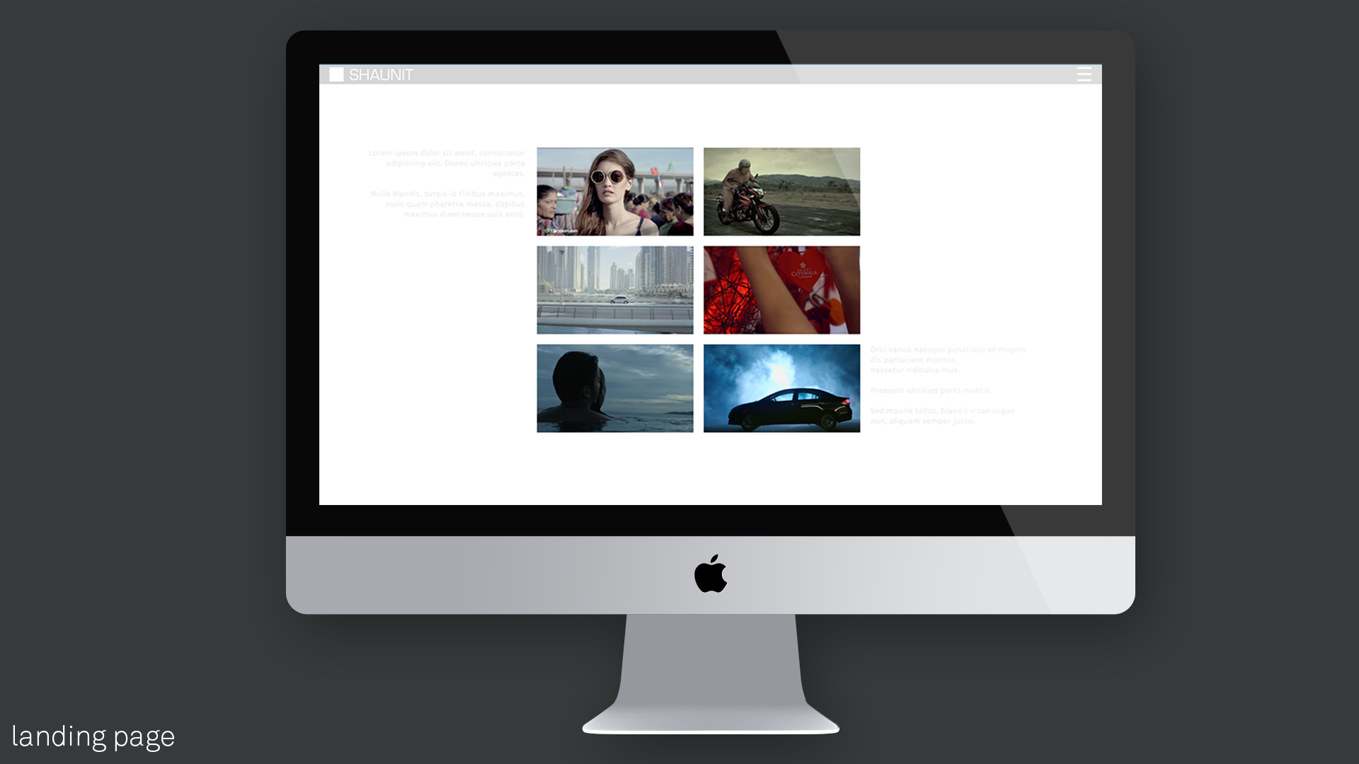
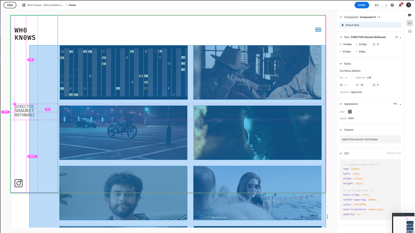
The project had started as a personal website for Director Shaunit Mothwani. I started off by creating a wireframe design. The concept for the home-page was inspired by a filmstrip. The wireframe also featured the directors notes that would be revealed only on hover as an Easter egg. My normal process is to start on mobile but the client had specifically requested that we start on the desktop version.
Iterate The new venture – SEP 2019
Nearly after a year, I was approached again to update the website for the director’s new venture – Who Knows. This time round, they approached me with an identity and vision.
Our goal was to make the website easy but there exists a fine line between that and generic. One that’s defined by the presence of character.
The process had several rounds of back and forth with the team at Who Knows in person and online. Once feedback had been collated, whatever could be done on the spot was changed right there and larger edits pushed to a concentrated day of finessing. As we reached a common ground, Who Knows would reverse the process and take our doubts and the prototype of the site to the key stakeholders and industry insiders.
Once their inputs came in we’d comb over the final round of the traits, designs and styles of the website. This is what got us to a crisp, modern and clean feeling that tried to keep the website as free of clutter and movement as possible.
Iterate Details
Transitions
The default transition for the site was a flashing white page caused by the DOM reloading. That was completely against our keep it smooth and seamless policy – after all, choosing the right transitions is something an ad agency should be good at. It reflected their aesthetic sensibilities in a sense so we opted to switch it for a sliding transition approach. Since all the backgrounds were white, it ended up giving the appearance of the content sliding around.
Shaunit, the founder of Who Knows, and I worked very closely on this part of the process. We observed that most of our referenced websites largely had two major elements governing the way they were designed. The first element was animation and the second was the type of content.
The sites had either very subtle or super heavy animations as part of their transitions, hovers and page changes. They both used animations to further enhance the focus on their filmmaking style. The serious/traditional ones kept transitions super clean and minimal while the playful/abstract ones utilised web design as another tool to highlight their creativity and know-how.
As for content, the brands always consciously seemed to try to distinguish themselves as either specialists or generalists. The specialists claimed insight into a particular industry while the generalists had an incredibly broad and diverse body of work.
This sort of market positioning was crucial in forming the decision to hire or not since brands often like to see their values reflected in their associates.
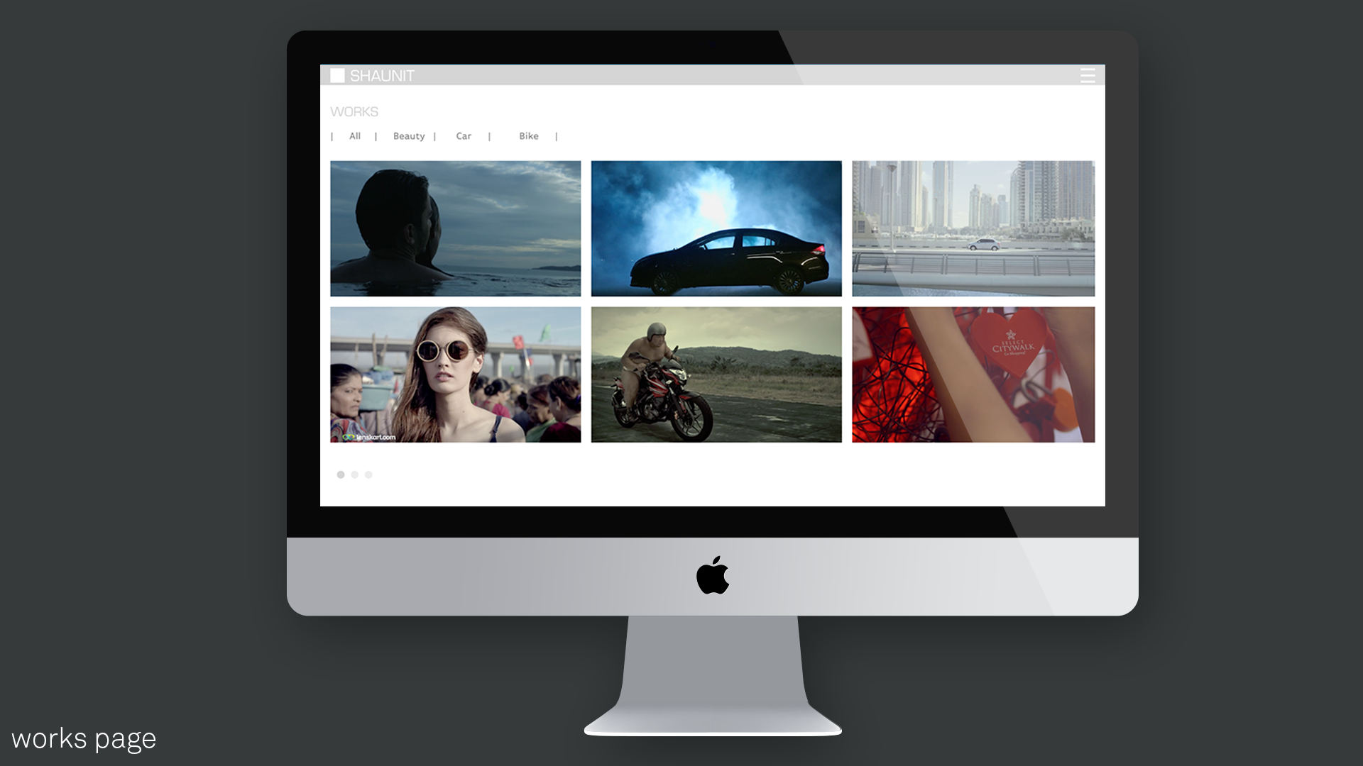
Grid
Our goal was to make the website easy but there exists a fine line between that and generic. One that’s defined by the presence of character. That’s why we avoided the most obvious choice and instead went for an uneven column layout for the site. This new rhythm personalised it and set Who Knows apart from the rest in its own little way.
Menu
The main aim with having the hamburger for both mobile and desktop was to minimize distracting visual elements. There were a few mandatory elements present so minimizing the visual footprint for functional items was a priority.
Implement Handoff V1
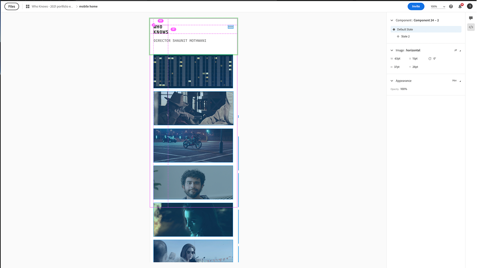
In the early days of the project, Adobe XD was still in beta (SEP 2018). The easiest method based on the connivence of the client and developer was to send screens with measurements.
Implement Handoff V2
The second time around, we had access to the share with developer function. This allowed the team to simply check code or leave feedback all from the browser. Singlehandedly the best feature of Adobe XD.
IMPACT
Through a thorough mix of market research, competitor analysis, testing and back and forth we ultimately arrived at exactly the kind of website WHO KNOWS had in mind. It was easy, quick and got straight to the point without being boring – which are all things that a good ad should be.
The experience taught me a lot about how these boutique agencies go about getting deals from larger ad firms or large corporations. By the end, it was abundantly clear what the companies were looking for. While a style of layout and aesthetics were required, it was largely speedy access and understanding that trumped.
The project served as a lesson that we don’t always serve the end-user, knowing who your client is and understanding what they want is always vital.